THE ASK
Branding / Packaging / Photography / Strategy
As a pioneer in the natural health beverage space, Odwalla helped create a category that has since become highly saturated and competitive. They came to us seeking a brand refresh that would stand out from the sea of sameness on shelf, offer the flexibility required to live across multiple product platforms and over 40 skus, and help connect today’s consumers to the rich heritage and brand personality that makes Odwalla unique.
OUR STRATEGY
The Artful Blend
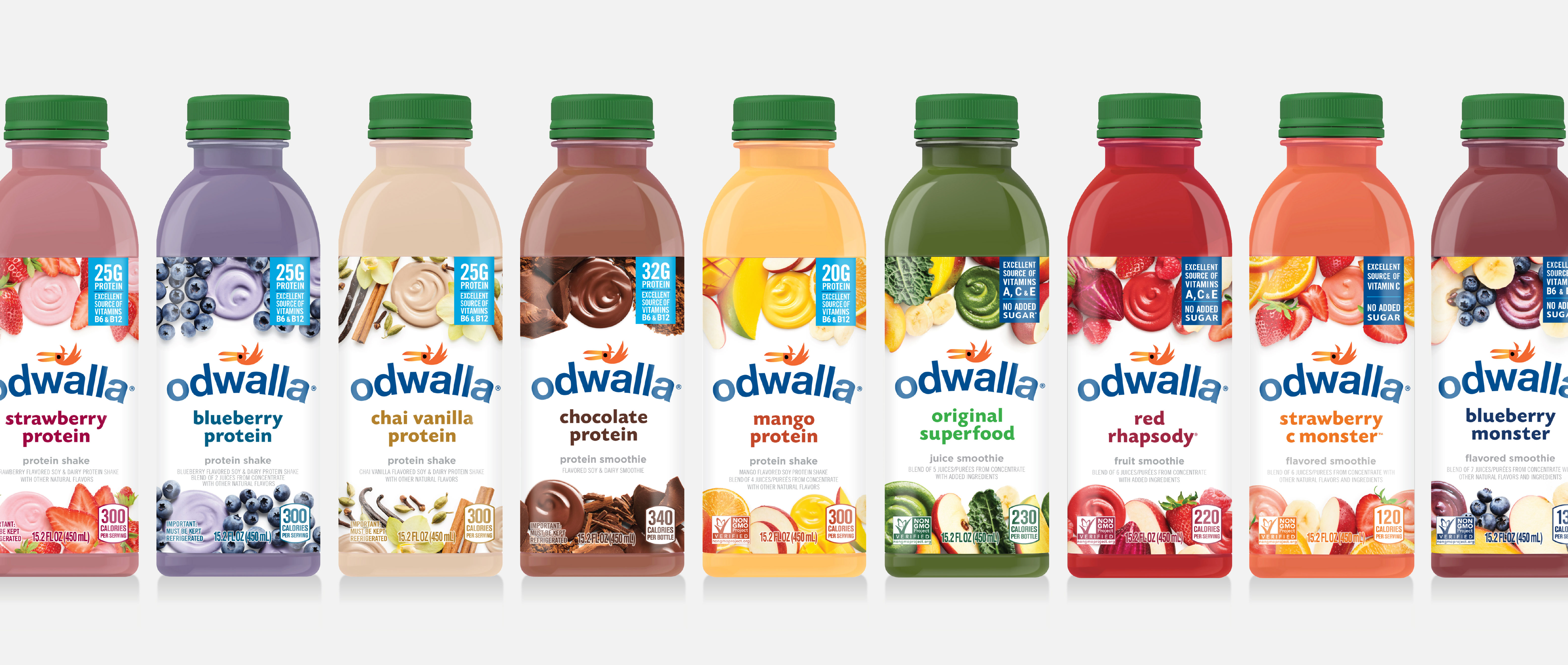
By artfully blending original food photography, a clean design aesthetic and just enough Odwalla personality to spark emotion, we created a highly functional and deliciously appealing design that invites consumers to re-engage with an iconic brand.

THE SOLUTION
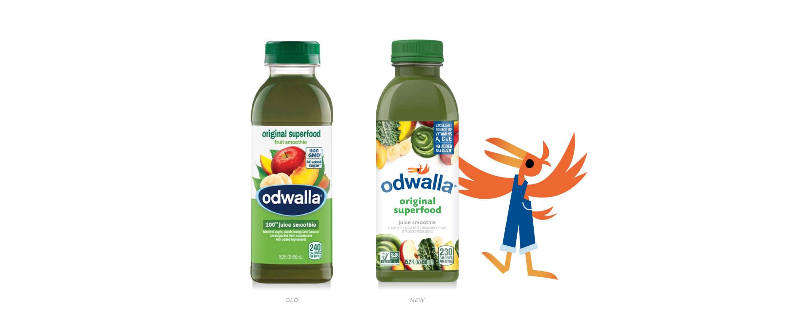
We started by streamlining the logo by shedding the badge and modernizing the font. We also reintroduced an updated take on the Odwalla bird icon for a touch of whimsy and a nod to the brand’s heritage.

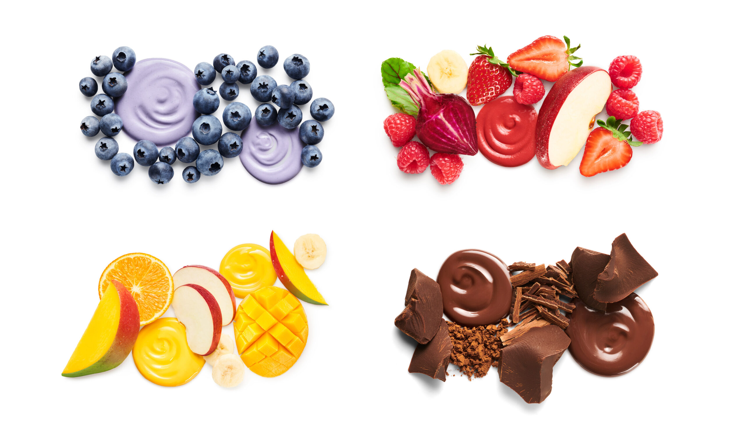
In streamlining the logo, we created more space for flavor to take center stage. Our photographic collages allow the abundant fruit ingredients and smoothie texture to shine. The result is a bold and scalable visual identity system that can flex across the product lines and reinforces the brand’s promise to nourish every body and soul.


THE PHOTOGRAPHY
Our original photography conveys the deliciousness of Odwalla’s artful smoothie blends with abundance, color, texture and luscious ingredient imagery.

BUILDING THE LINE EXTENSION
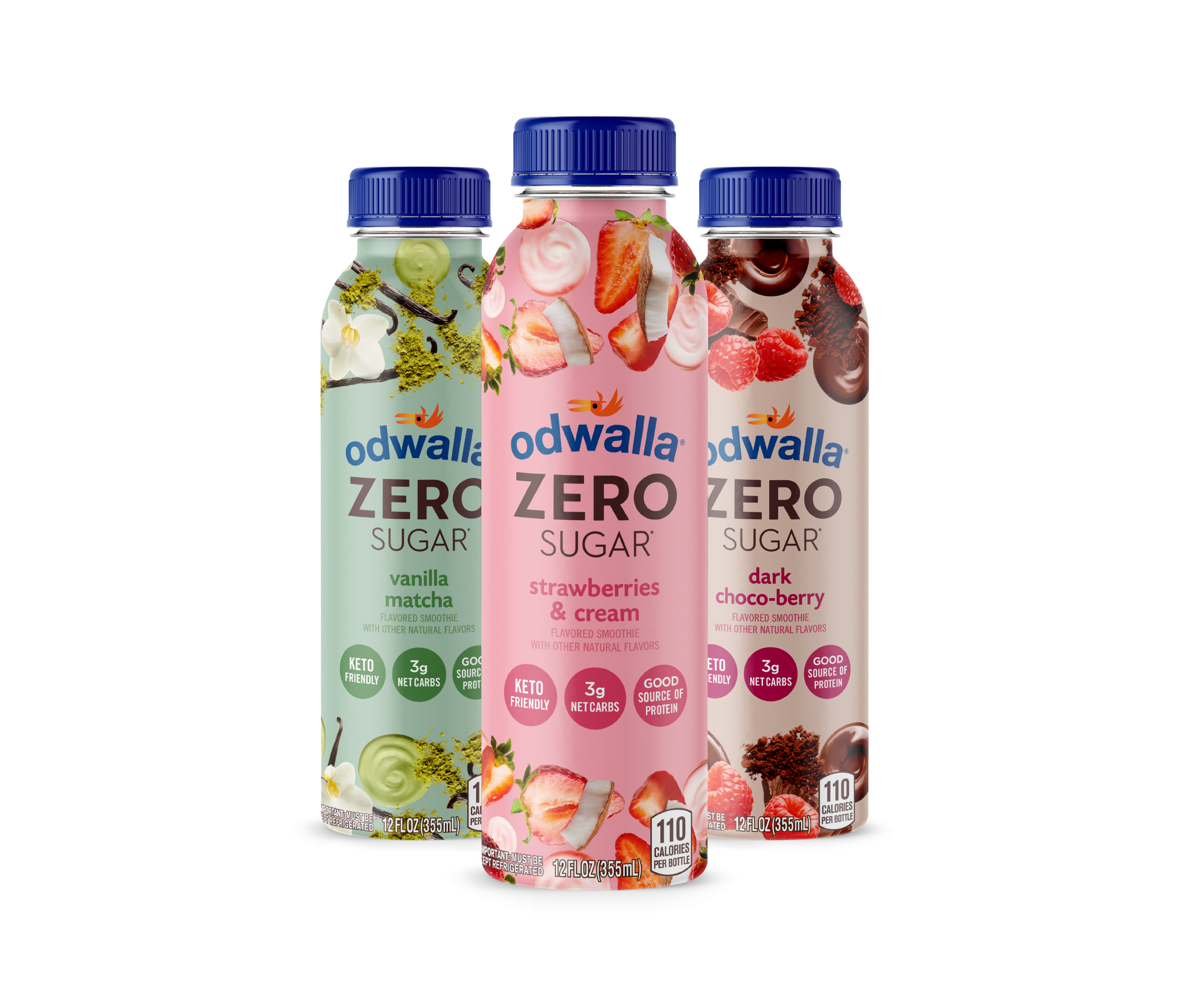
With the success of the core line redesign, we were asked to extend the design to Odwalla’s newest innovation, Odwalla Zero Sugar. “Odwalla is launching its most innovative product yet: Odwalla Zero Sugar… One of the first zero sugar smoothies to hit shelves, Odwalla Zero Sugar provides consumers with a good source of protein made with keto friendly ingredients.”
– bevnet

