
THE ASK
Branding / Strategy / Packaging / Photography
Passion for Food, Family, and Partnerships
Peterson is a family-owned specialty food purveyor with expertise in importing, distribution, and conversion. For over seventy years, they have built trusted partnerships with suppliers and customers to meet diverse needs and embrace food trends. They came to us for a full rebrand to ensure that their spirit and dedication continues to resonate today.

THE SOLUTION
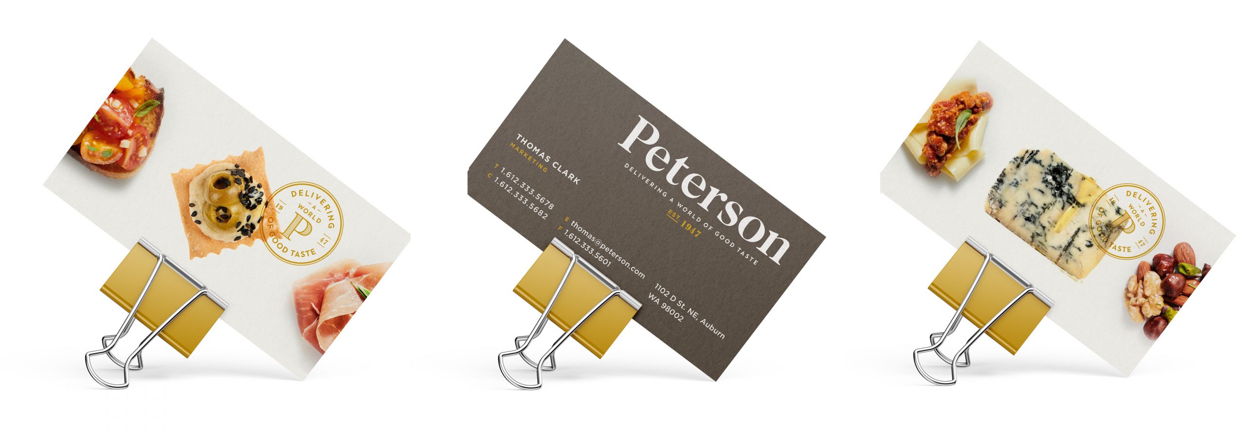
Since 1947, Peterson has maintained a high standard of top-notch customer service and is proud to conduct business with care and integrity. That commitment has helped them become a leading importer of European specialty foods. We leveraged that company resolve into a brand identity that communicates a history of trust, personal care, and great food.

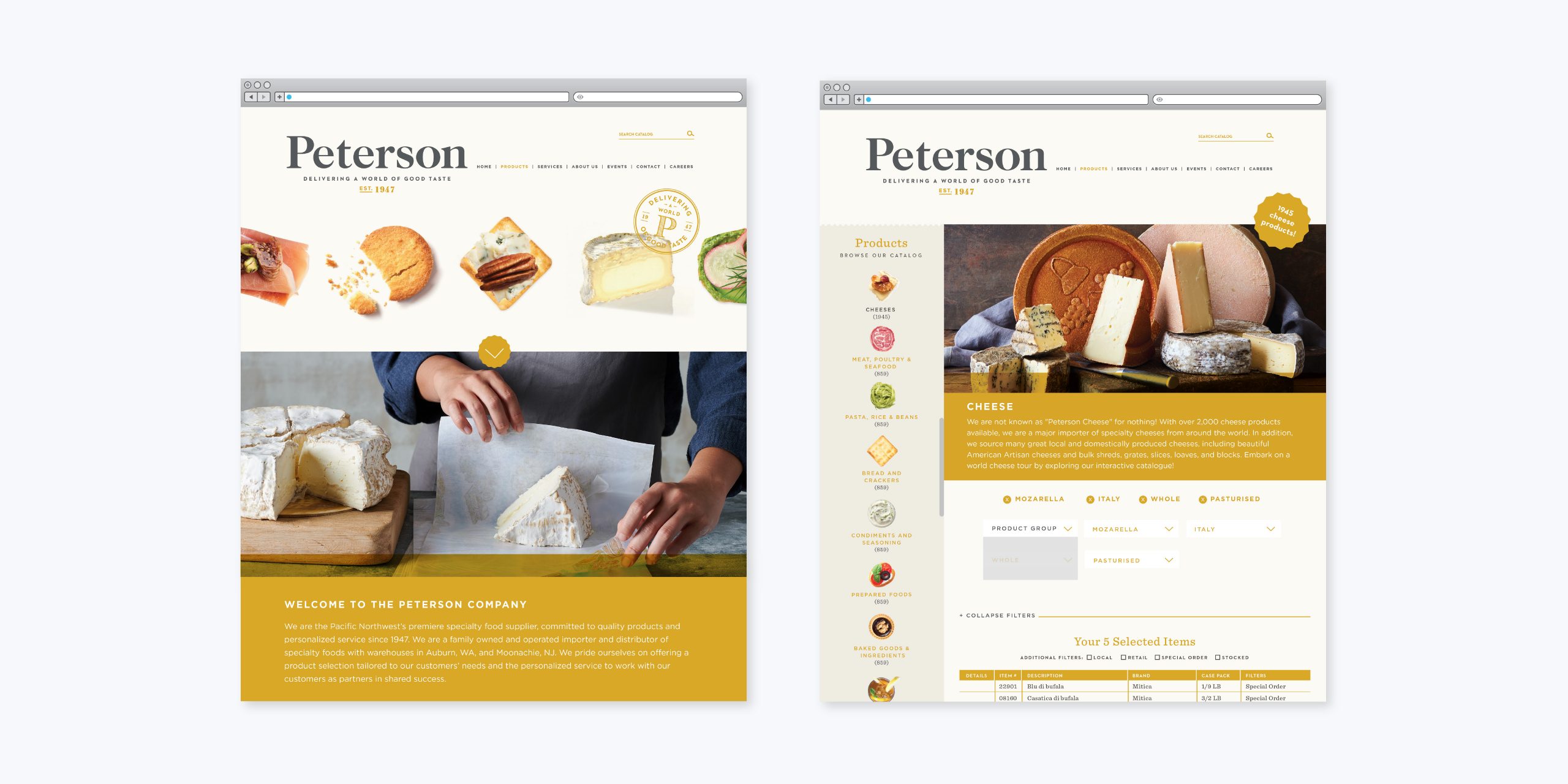
The logomark was created to be flexible for their ever-growing brand proliferation. We removed the cheese reference as their offerings have grown significantly over the years to include meat and other pantry goods. With lowercase letters, the wordmark becomes friendly and inviting, and we included the year the company was established to emphasize longevity.


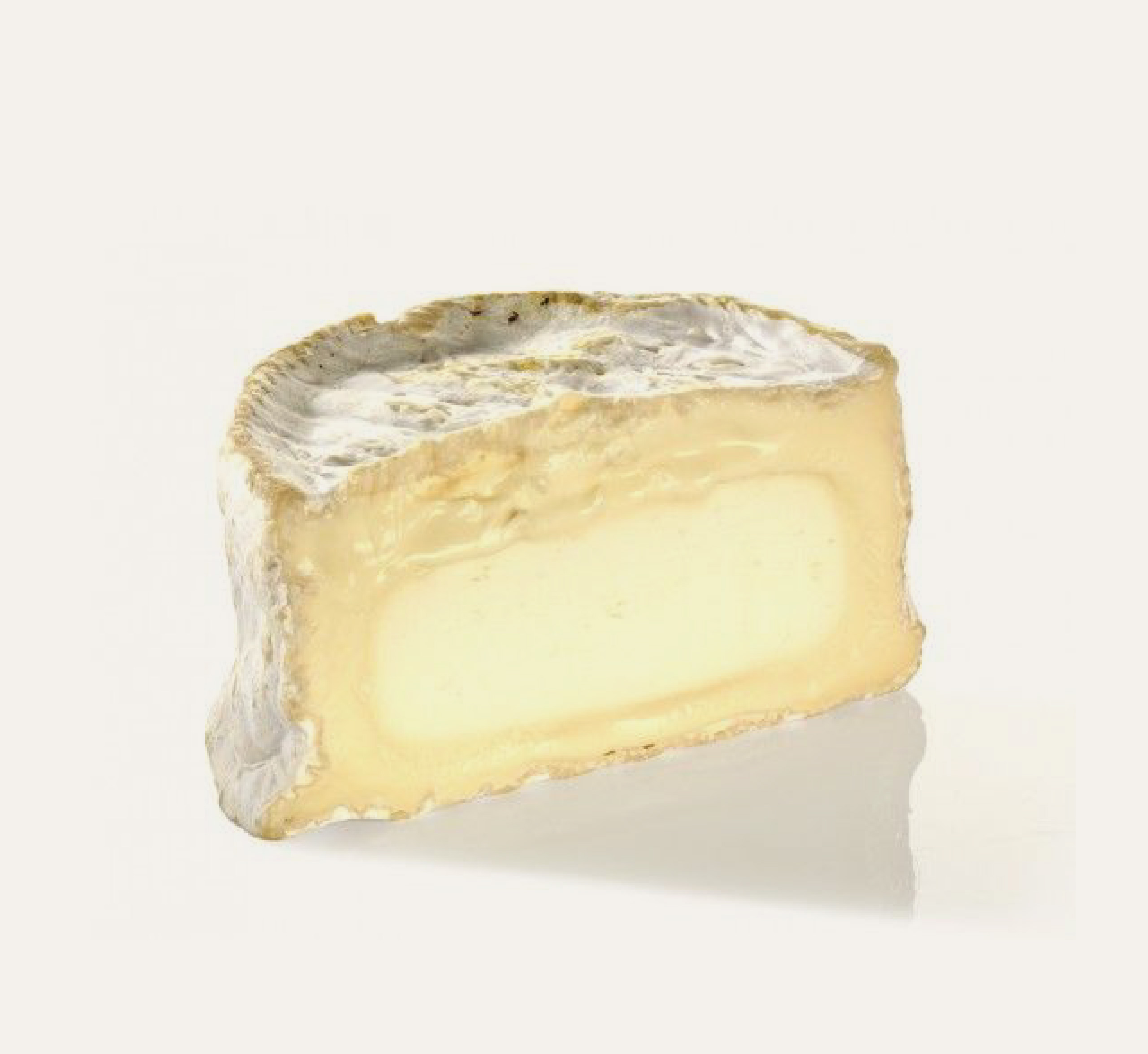
Closeup photography of the artisans’ craftsmanship and detailed shots of the food communicate company transparency and skill. The precision and knowledge that goes into every product comes through via the action of working hands as they ply their craft.


