A TASTE OF Magique
Petit Pot brings traditional French desserts to the Bay Area and all across America with a short and sweet list of organic, locally-sourced ingredients, all wrapped up in sustainable packaging.
After adopting a recent rebrand, Petit Pot reached out to us to put the finishing touches on their new packaging by increasing taste appeal, developing their online shopping experience, and expanding the rebrand into multiple touchpoints to maintain a cohesive, deliciously stylish look.

Happyness IN A JAR!
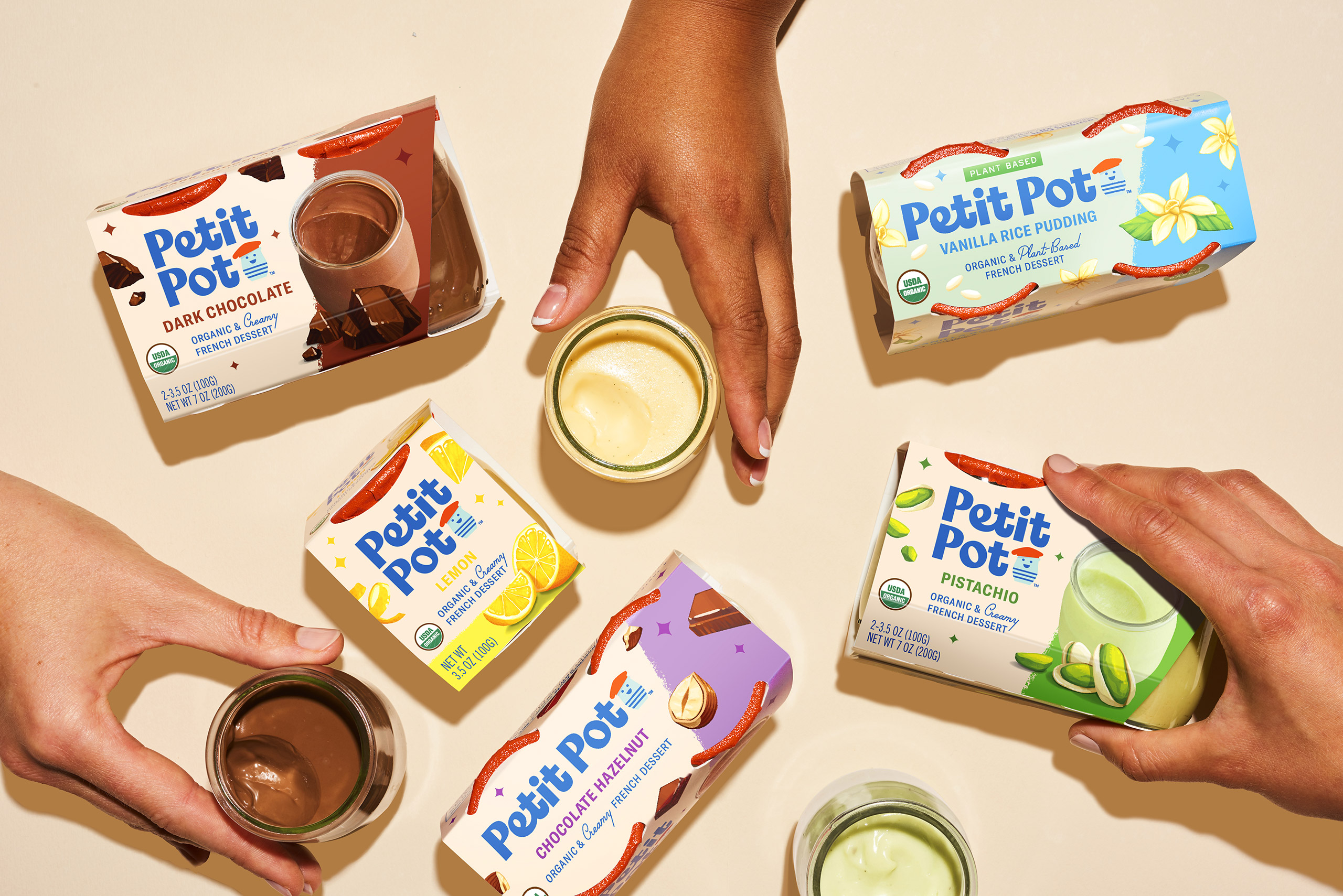
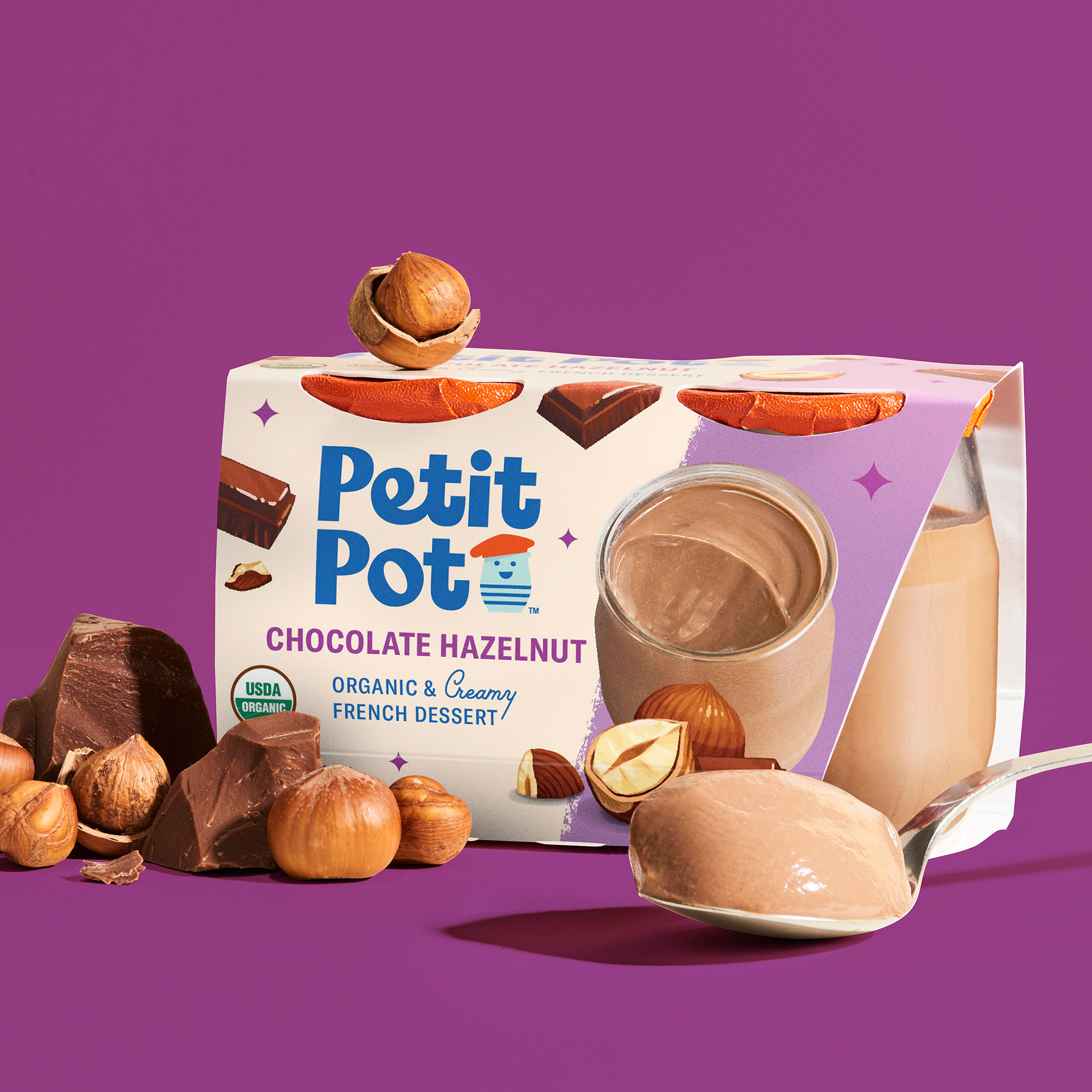
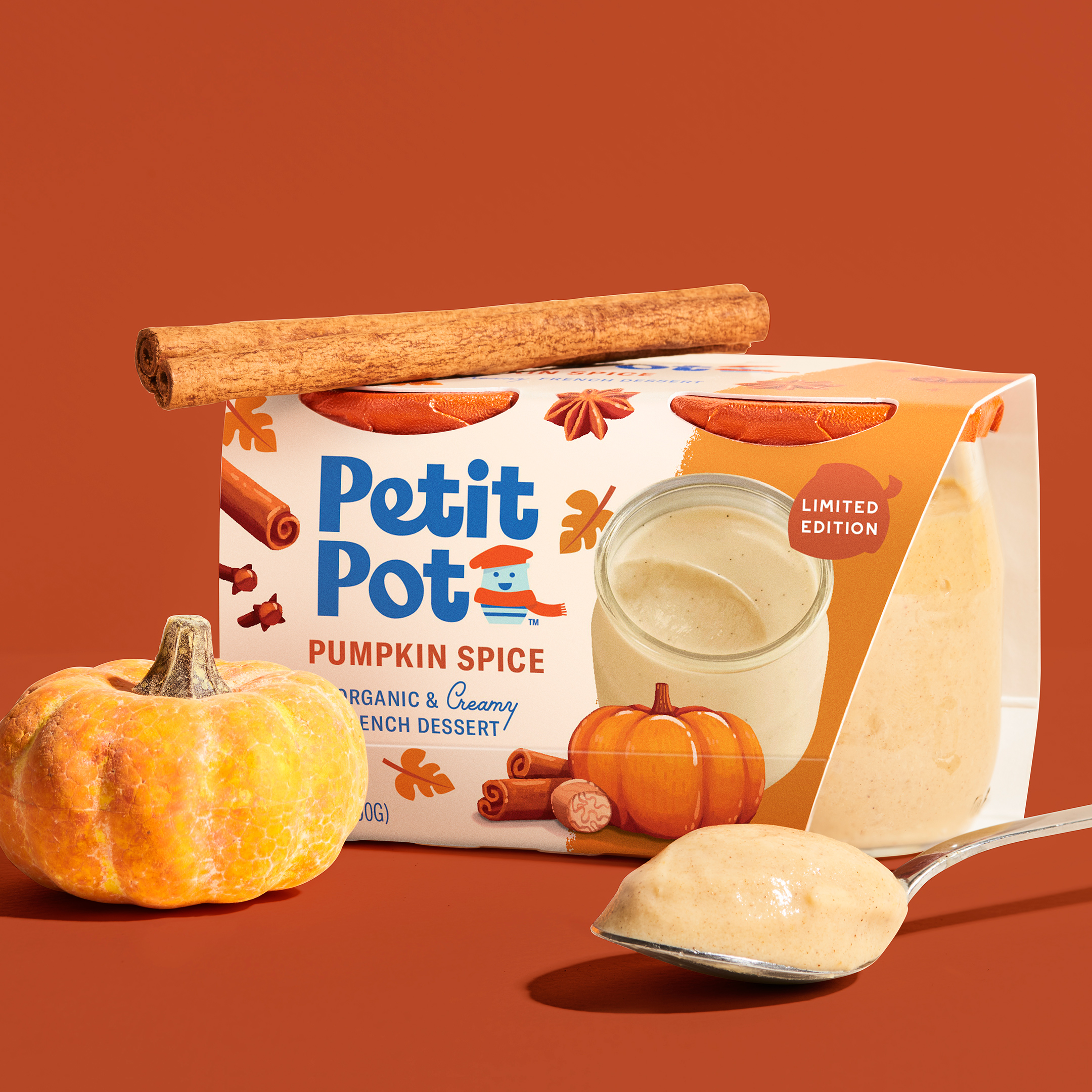
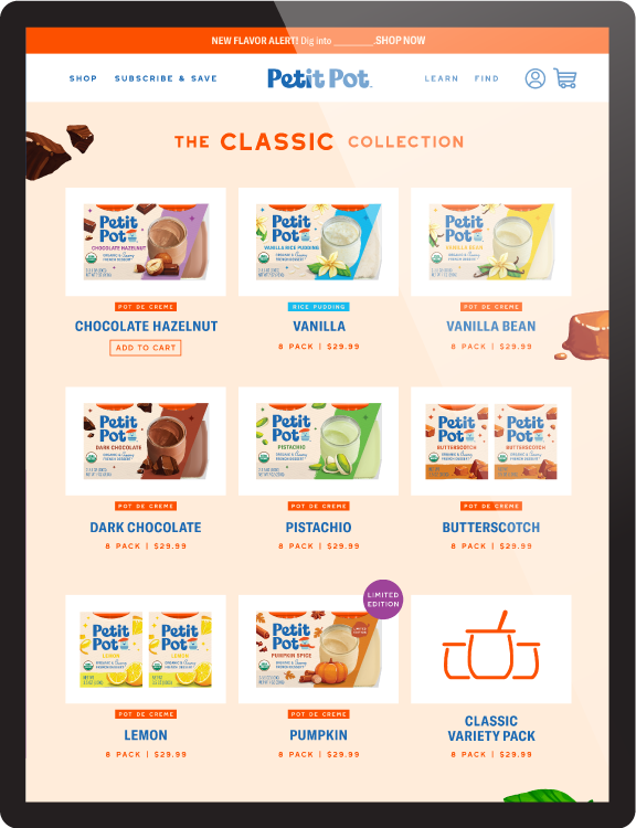
Our mouth-watering, up-close photography of the textured desserts on the new packaging maximizes the appeal of the delectable treats. An angled view of the petite jars, highlighting the creamy consistency and specks of vanilla, creates an irresistible look that pops on shelves. Whole Foods distributors were excited to see the change and showcase the packaging on their dessert aisles.
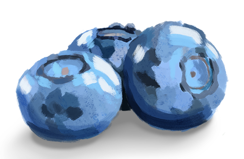
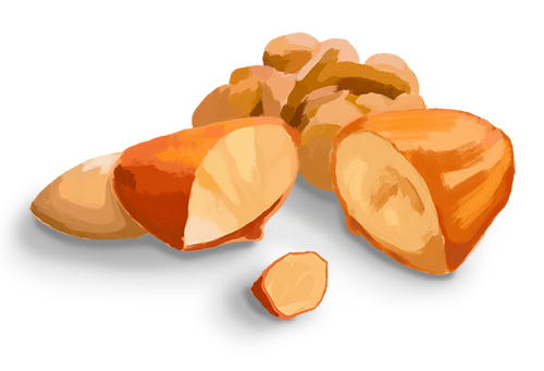
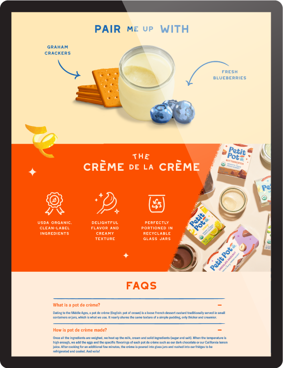
For the website, we paired the desserts with illustrated ingredients made with bold brushstroke textures. The blend of photography and illustration is not only unique and ownable, it perfectly captures the flavors waiting in every bite!
PICTURES WORTH A Magique BITES
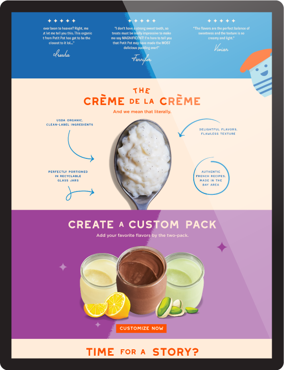
The photography brings together Petit Pot’s best features: rich textures and real ingredients, sitting proudly next to the colorful packaging. Bold backgrounds and hand-picked, farm-fresh ingredients promise delicious flavor in every jar, while large dollops of pudding, freshly scooped on a spoon, make every shot scrumptious.


A Site TO See
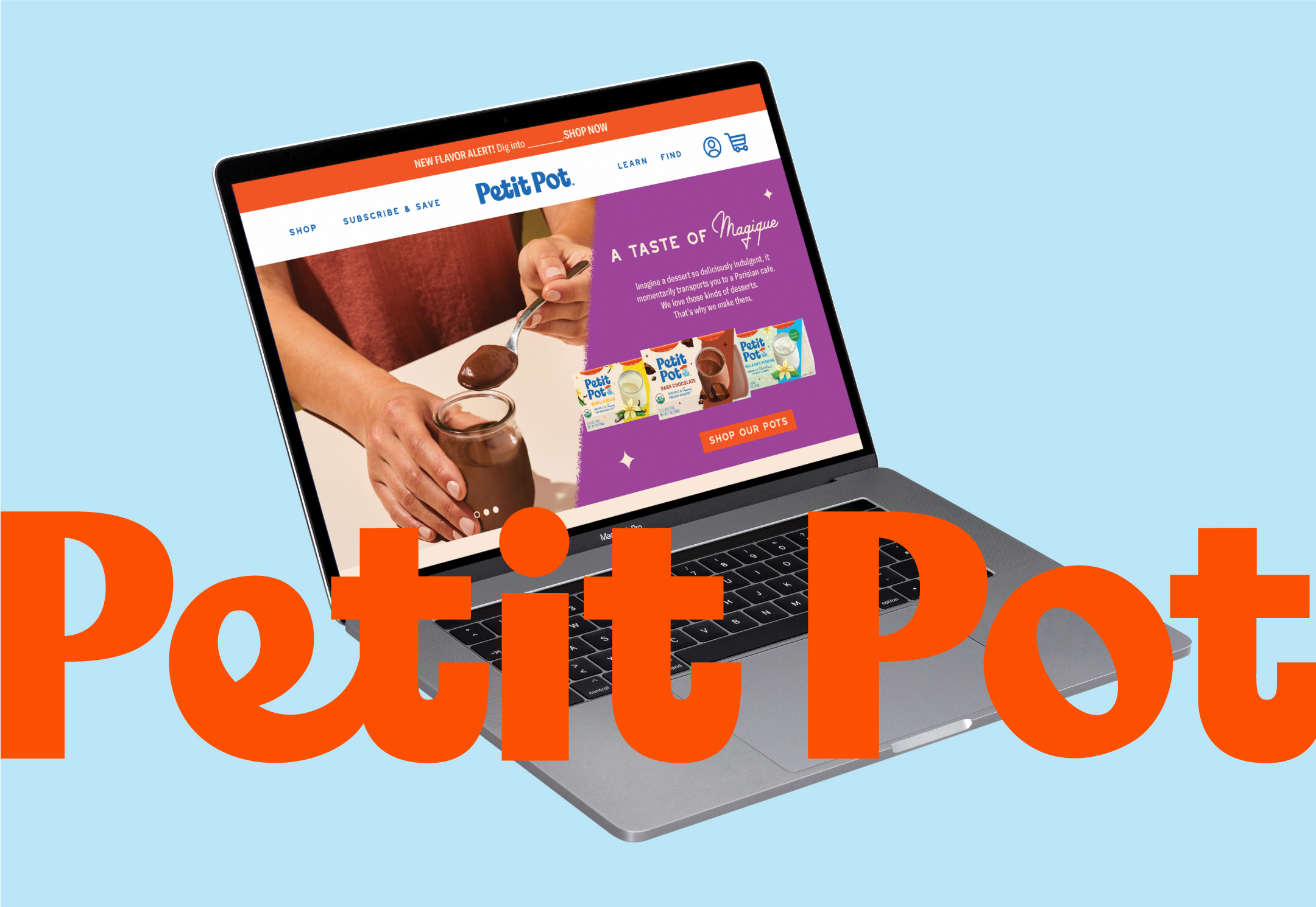
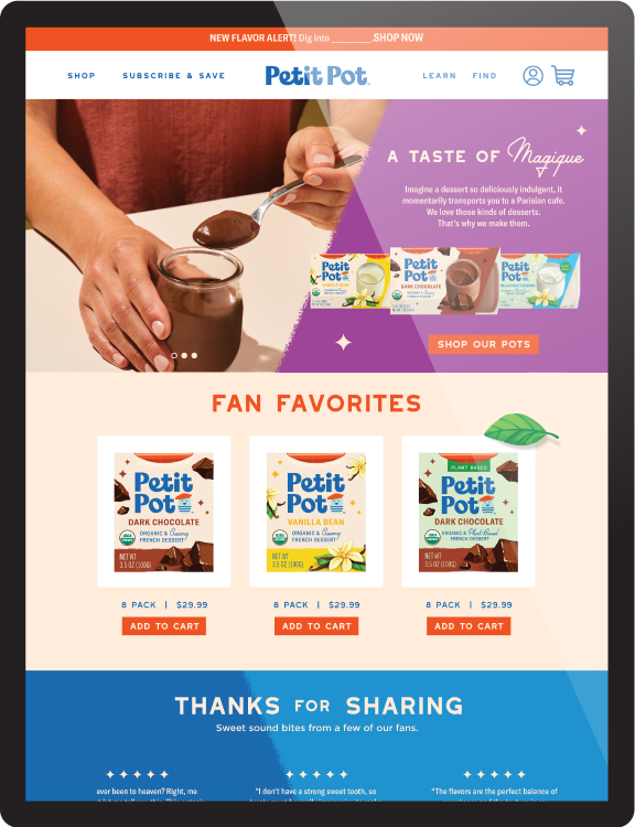
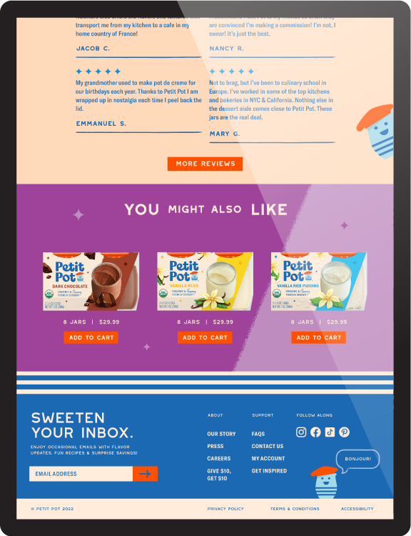
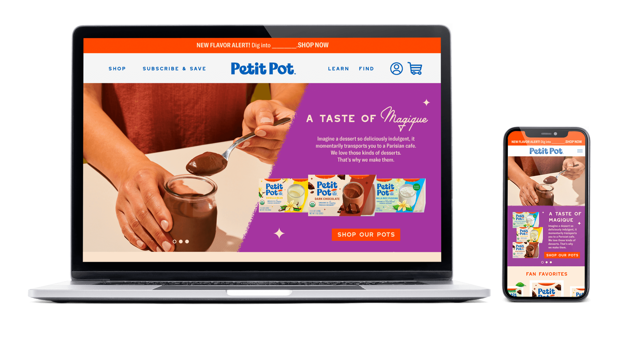
For the online shopping experience at PetitPot.com, we maintained a throughline of bold colors and vivid photography, all accomplished in-house. The striking action photography is complemented by hand-drawn elements as well as animation for a dynamic and welcoming shopping environment. Ambassador Louis, the brand mascot, playfully pops in and out at unexpected moments to guide visitors through a charming user experience.


CONSISTENCY IS Key
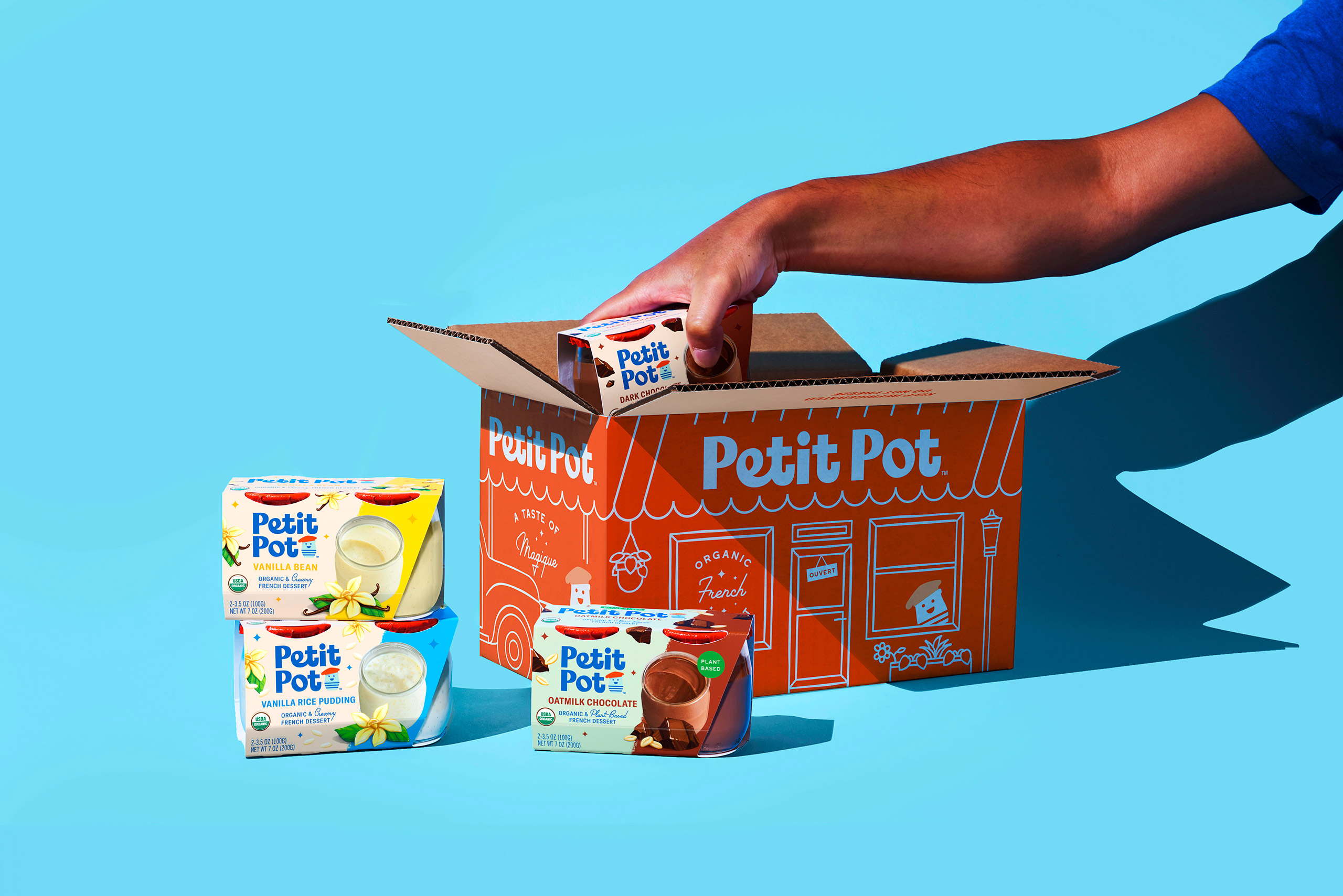
We developed shipper boxes, Costco packs, and additional collateral that reinforces the dessert’s sweet and whimsical style. The Petit Pot orange color is featured prominently as a key brand element that makes the dessert company consistently recognizable on store shelves, the website, or on the shipper boxes that reach customers across America.
