HELLO
Olio is an integrated creative studio for food brands that make an impact beyond the kitchen. We build stories for brands that celebrate good food and a healthy future for our children and our planet.
Coming soon
Coming soon!
New Breed
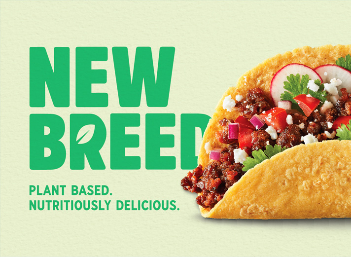
THE ASK Strategy / Branding / Packaging / Photography A Breed ApartCrafted by Co-founder Samantha Edwards in her kitchen, New Breed is a plant-based, community-powered food brand. Based on 20 years of research in plant-based nutrition, New Breed offers a proprietary...
Coming Soon
Coming Soon
Petitpot
A TASTE OF MagiquePetit Pot brings traditional French desserts to the Bay Area and all across America with a short and sweet list of organic, locally-sourced ingredients, all wrapped up in sustainable packaging. After adopting a recent rebrand, Petit Pot reached out...
Fellow
Structural Design / Branding / PackagingBrewing Up a Fresh Look Since its initial Kickstarter campaign in 2013, Fellow has been dedicated to providing a coffee brewer that is both functional and stylish. Today, Fellow boasts a wide range of coffee and tea brewing...
Steamies
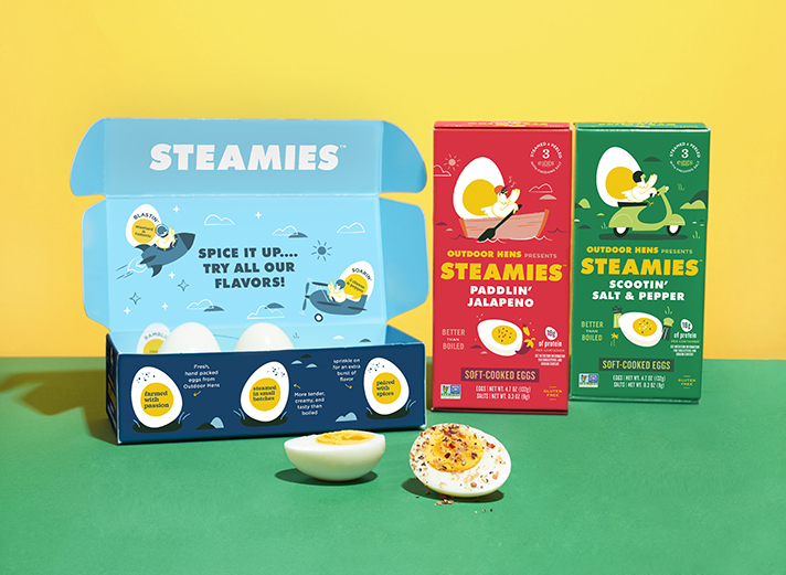
THE ASK Branding / Packaging / Photography / StrategyBye Bye Boiled. Hello Steamies!As Outdoor Hens was becoming a success on the grocery store shelves, it was time to expand the brand. We developed naming and packaging for a line of steam cooked eggs called...
Wildwonder
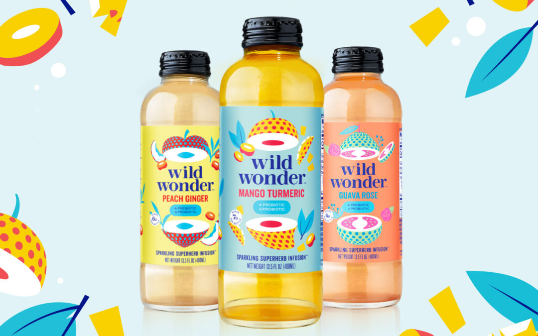
THE ASK Branding / Strategy / Packaging / PhotographyEveryday Wonders!Wildwonder created a new category in the health dring space with their sparkling blend of superherbs, fruits, and live vegan probiotics that provide gut-healing and immune-boosting power in one...
Odwalla
THE ASK Branding / Packaging / Photography / StrategyAs a pioneer in the natural health beverage space, Odwalla helped create a category that has since become highly saturated and competitive. They came to us seeking a brand refresh that would stand out from the sea...
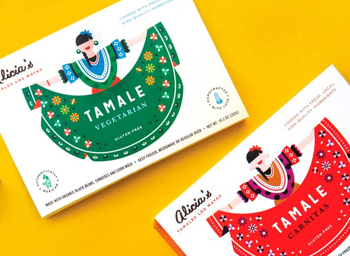
Alicias
ALICIAS LOS MAYASAlicia’s tamales’s main ingredients are generosity, celebration, authenticity and great taste. Her home style, carefully crafted recipes are performed by a well trained team, whose precise and well orchestrated cooking procedures elevate a simple,...
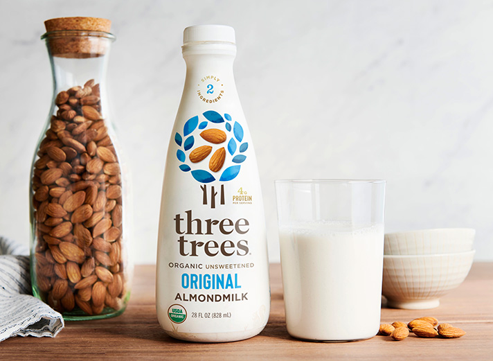
Three Trees
THE ASK Branding / Packaging / Photography / StrategyThree Trees is guided by the philosophy that true nourishment comes directly from nature. Their commitment to use only whole plant-based ingredients (no emulsifiers, stabilizers or thickeners) to create their rich...
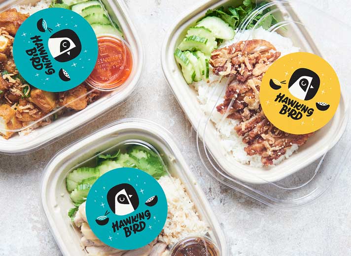
Hawking Bird
THE ASK Branding / Strategy / Packaging / PhotographyCasual Eatery with Serious FlavorFounded by Oakland’s own Chef James Syhabout, Hawking Bird is the sister restaurant of Syhabout’s trendy Hawker Fare. Both provide a tantalizing blend of Southeast Asian flavors, but...
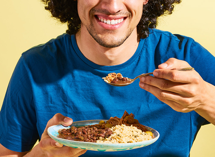
Dozen Cousins
THE ASK Branding / PhotographySoulfully SeasonedThe brand name was inspired by the founder’s daughter, her 11 cousins, and the many delicious family meals they enjoy together. Combining the idea of a large gathering expressed through the dozen utensils in the logo,...
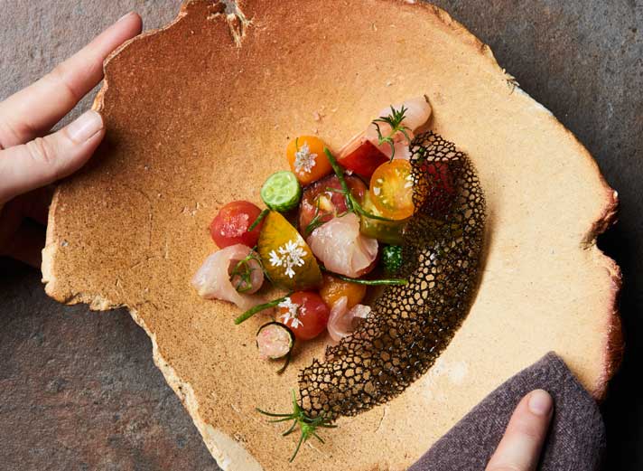
Nightbird & Linden Room
THE ASK Branding / PhotographyA Chic Setting for a Remarkable MealNightbird is an elegant, boutique restaurant in the heart of San Francisco that offers a whimsical pre-fix dining experience. Next door is Linden Room, a speakeasy-style cocktail lounge with stylish and...
St Johns
ST JOHN FAMILY FARMThey take eggs very seriously on the St John Family Farm. Each hen starts their day by having their eggs collected by hand and being fed a custom blend of non-GMO, vitamin-rich feed before being set free to explore, chase bugs outside, and snack on...
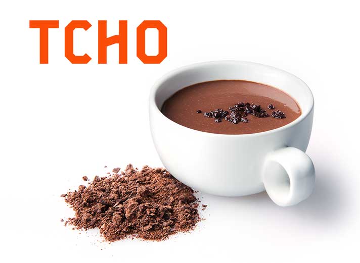
TCHO
THE ASK Branding / Strategy / Packaging / PhotographyChoice Chocolates A premium chocolate maker based in Berkeley, TCHO is best known for its close collaboration with cacao farmers and cooperatives to produce the highest quality beans. From single-serving chocolate...
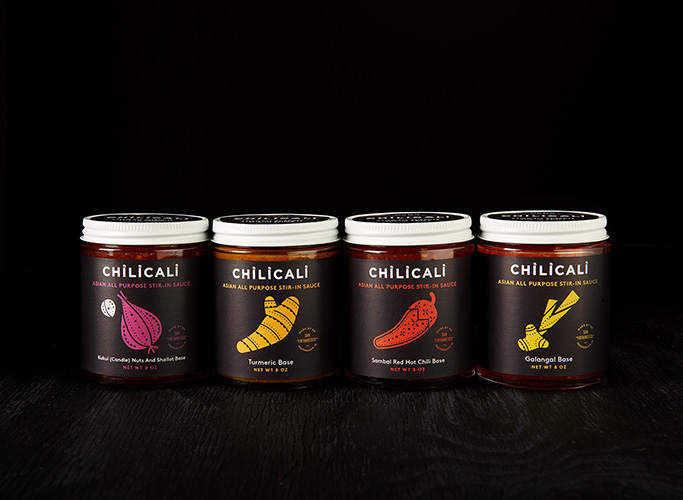
Chilicali
CHILLICALIFounded by Chef Siska, Chilicali makes a line of wholesome,locally-sourced cooking sauces that are inspired by traditional Indonesian “Bumbu Dasar” (Base Spices).THE ASKIntroduce “Bumbu” to a new audience of modern, health-conscious consumers while honoring...
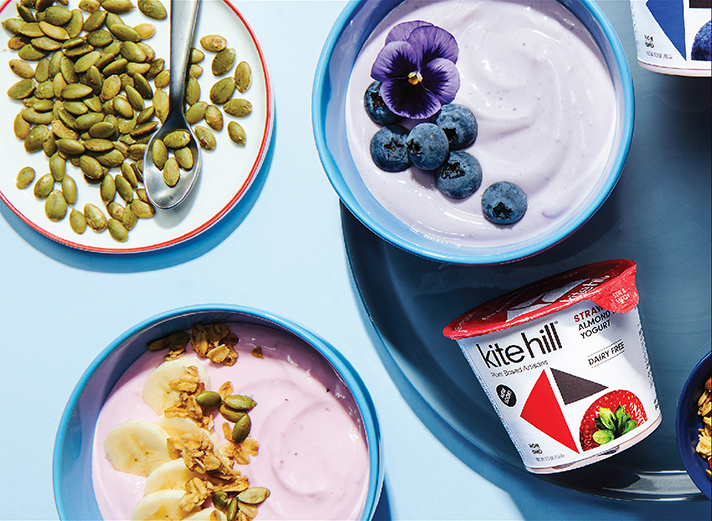
Kitehill
THE ASK Branding / Strategy / Packaging / PhotographyAppetizing Almond Milk Creations Kite Hill is a plant-based, dairy-alternative brand that uses locally sourced and natural ingredients to produce fresh ricotta, creamy yogurts, and rich cream cheeses—all out of...
Mammoth Bar
THE ASK Branding / Strategy / Packaging / PhotographyMighty Food on the MoveMammoth Bars are nutrient dense protein bars made with sprouted almonds and naturally sweetened with dates: no weird stuff, just simple ingredients. The founders came to us to help visualize...
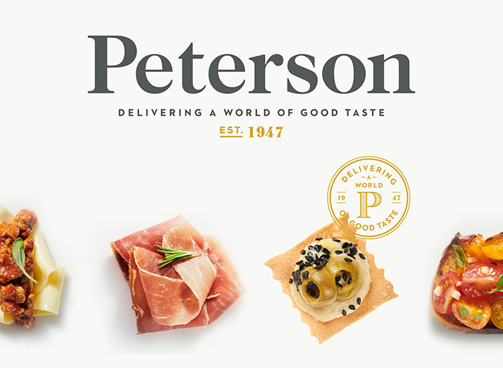
Paterson
THE ASK Branding / Strategy / Packaging / PhotographyPassion for Food, Family, and PartnershipsPeterson is a family-owned specialty food purveyor with expertise in importing, distribution, and conversion. For over seventy years, they have built trusted partnerships...
