THE ASK
Branding / Packaging / Photography / Strategy
Three Trees is guided by the philosophy that true nourishment comes directly from nature. Their commitment to use only whole plant-based ingredients (no emulsifiers, stabilizers or thickeners) to create their rich and creamy nut milks is a differentiator within the crowded and fast-growing plant-based milks category. They came to us in need of a full redesign—from bottle shape, to graphics, to logo—that would underscore the superior ingredient integrity of their product and create a compelling presence on-shelf.
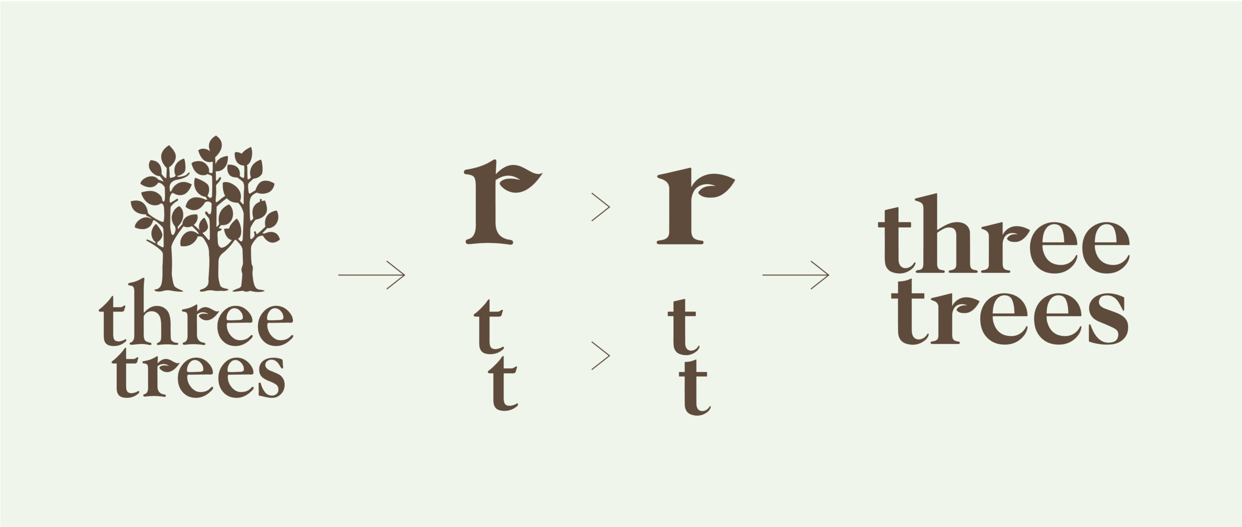
We evolved the logo for a more modern and versatile mark that can live across different graphic contexts and usages.
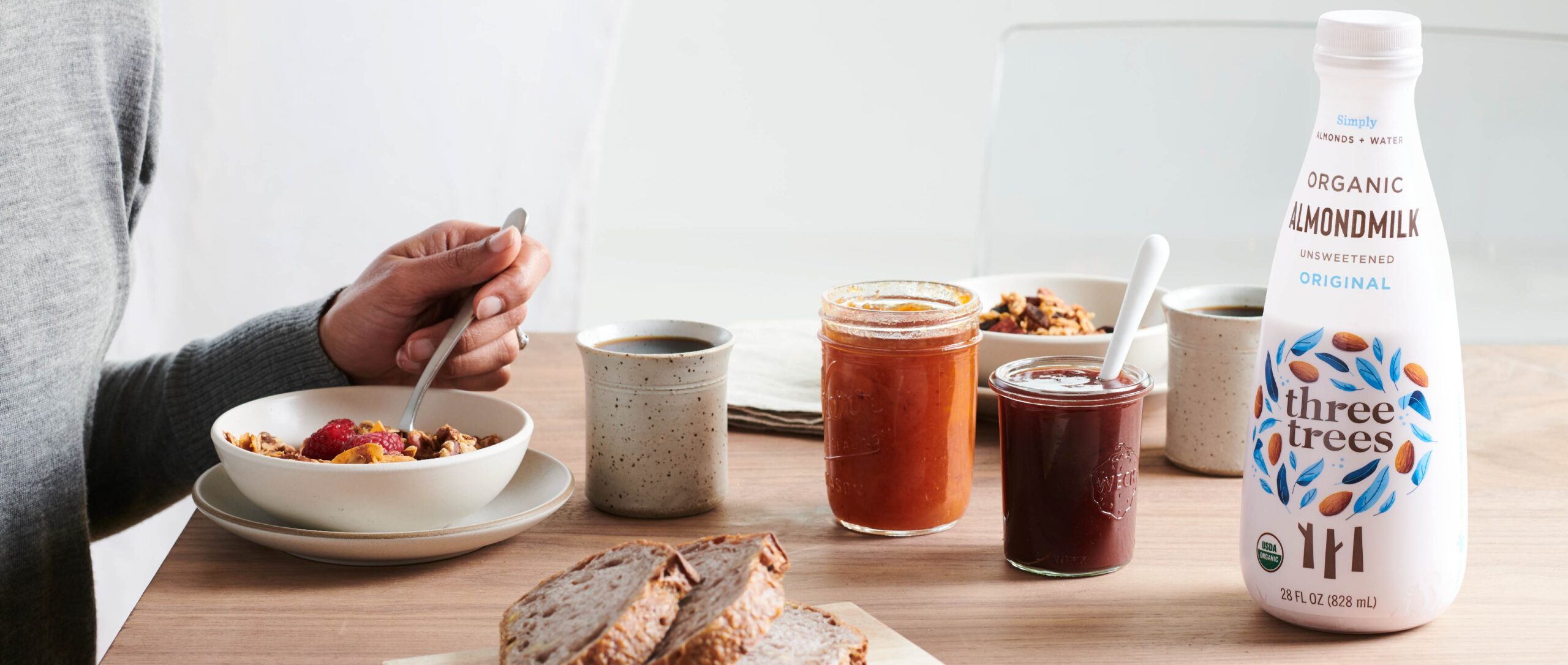
We started by designing a unique bottle shape with smooth curves and a narrow neck for a fresh visual silhouette and an easy pour that perfectly complements the creamy nut milks inside.
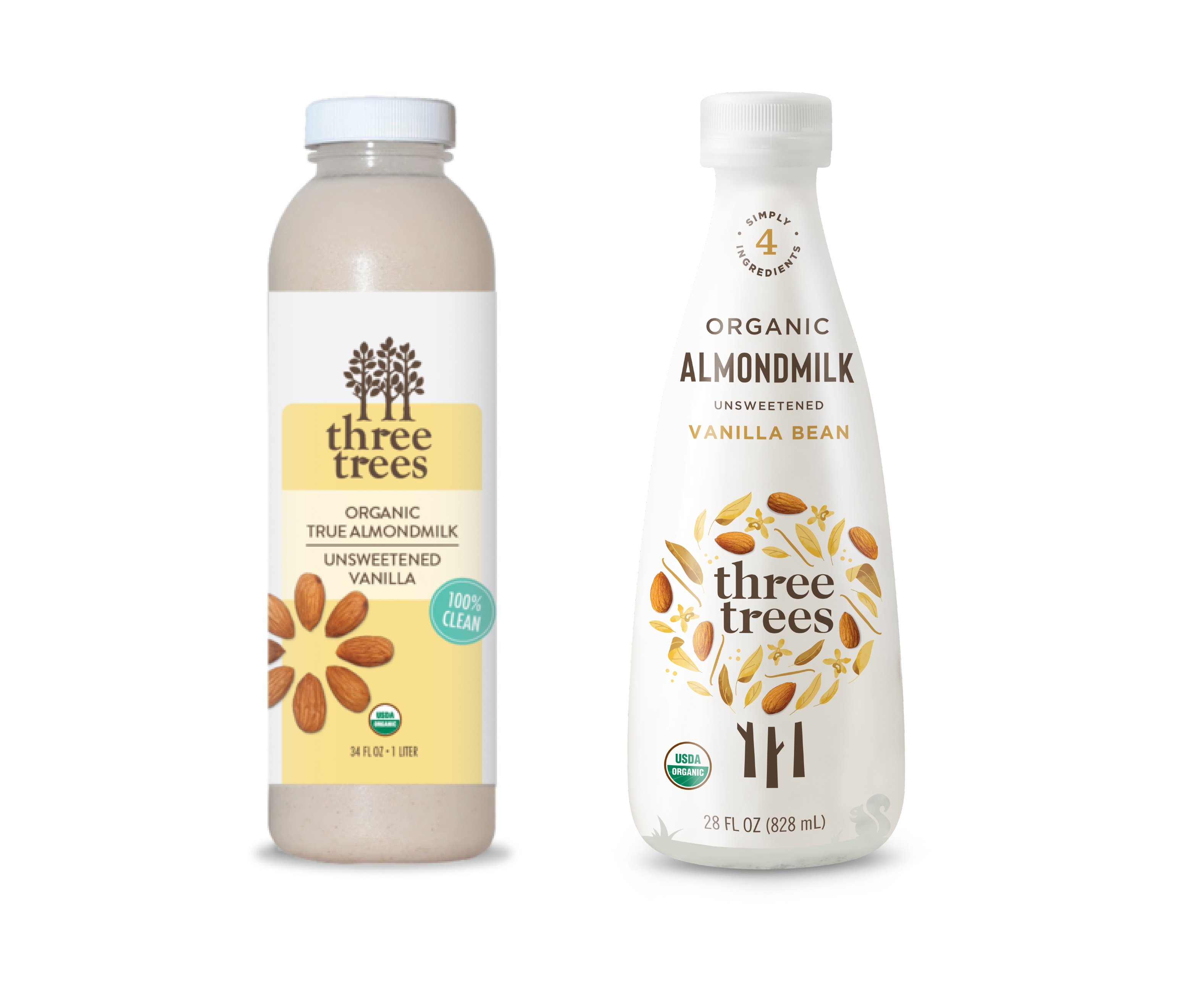
Our label design allows the simple, purity of the ingredients and their natural source come through while the matte, creamy white backdrop communicates the smooth richness of the product experience.
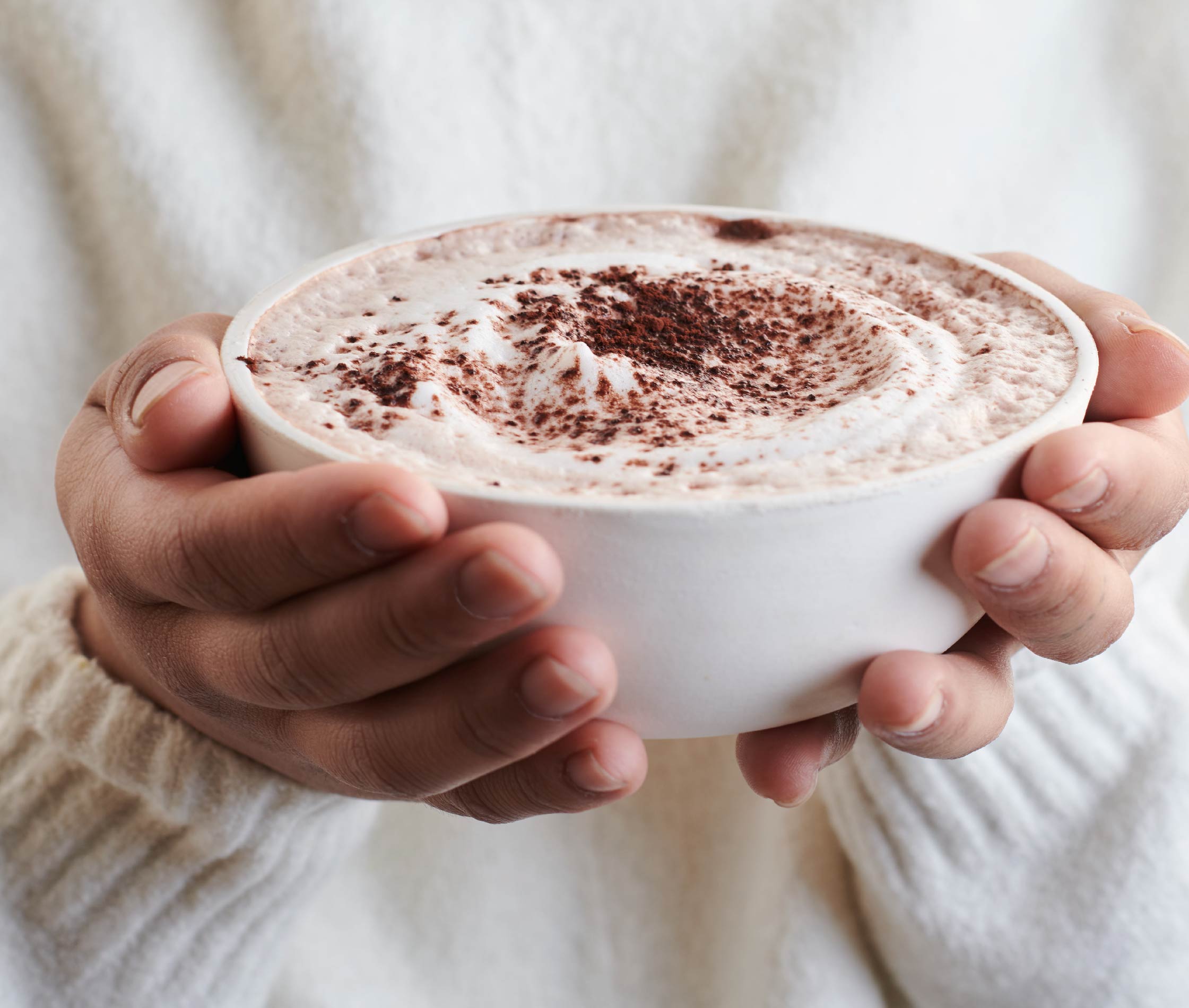
Our product and lifestyle photography creates additional brand moments with a nod to nature and the deliciousness of pure, simple, high-quality ingredients.
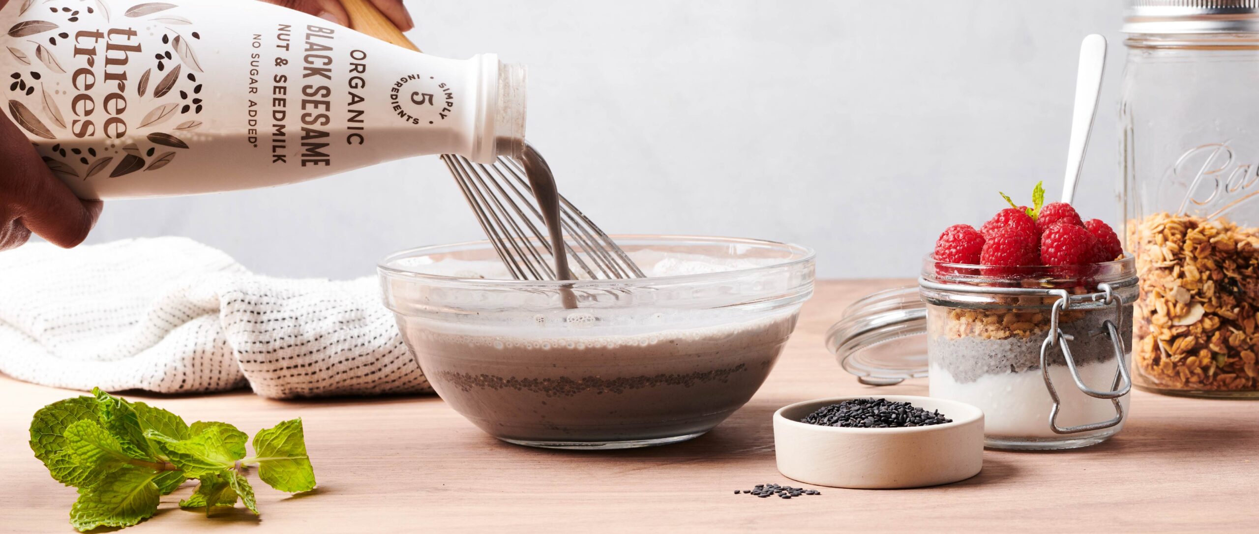
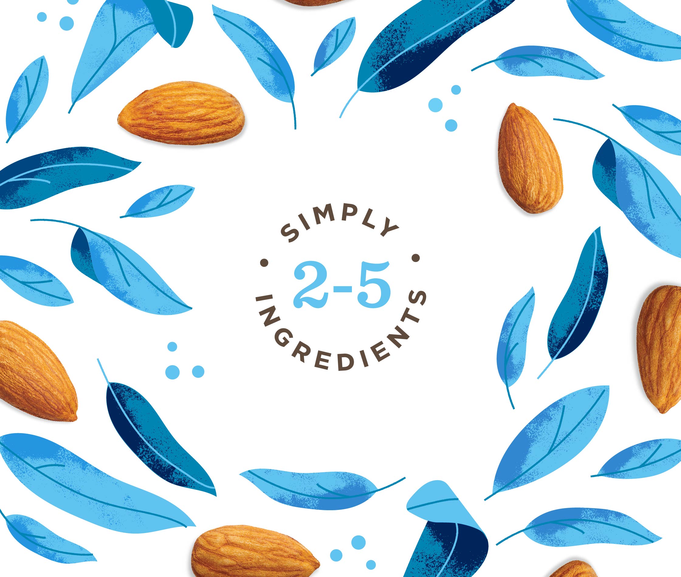
Our original illustrations and graphic icons create a cohesive, secondary brand language for use across a range of marketing materials.
GREEN AND GORGEOUS
Who says blond nuts have more fun?
THE REAL DEAL
Super creamy. Very almondy. Pure white.
VISIBLY VANILLA
This is what great vanilla almond milk should look and taste like
OPEN SESAME
A treasure trove of flavor and nutrients

Separation means it’s real, just Shake it.

Take it off! For Improved Recycling
